Users
Pattern Library & Component Library - UX Designers and UI Developers
Design System - UX Designers, UI Developers, Business Partners, Leadership
Objective
Across the company, there are approximately 10 decentralized teams, each comprised of 2-3 designers. However, there existed unclear design standards for internal applications, and no pattern library was available to source components from. Consequently, this lack of consistency led to variations in the appearance and functionality of applications across the organization.
Goals
1. Document all components
2. Work with internal team members to create a pattern library with XD components
3. Collaborate with developers to build react components based on the components ensuring that interactions, spacing, and colors adhere to guidelines
4. Bring everything together into one centralized place (we used Sharepoint for our Design System)
Inventory components
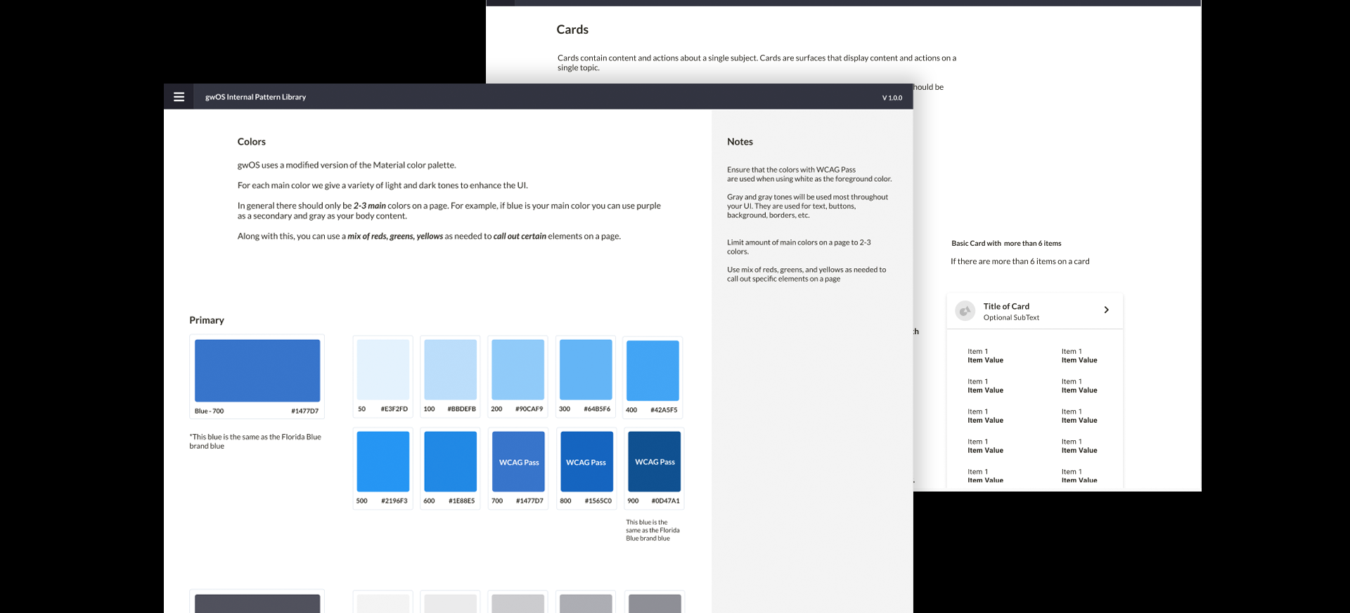
This was a huge task because we have 30+ applications spread across 10 different domains. I went through each application and took screenshots of components we had in each of the applications. Some of the components are pretty standard (such as typography, buttons, font icons, etc.) so those were a little easier to capture.
In addition to the screenshots, I also reached out to each designer to provide me with components that I may have missed while putting together the inventory. I wanted this to be a collaborative effort, so I made sure to include the internal designers as I was working on this. We use Material UI for our front-end framework, so I also reviewed and listed out components from there, noting any overlap or items missing.
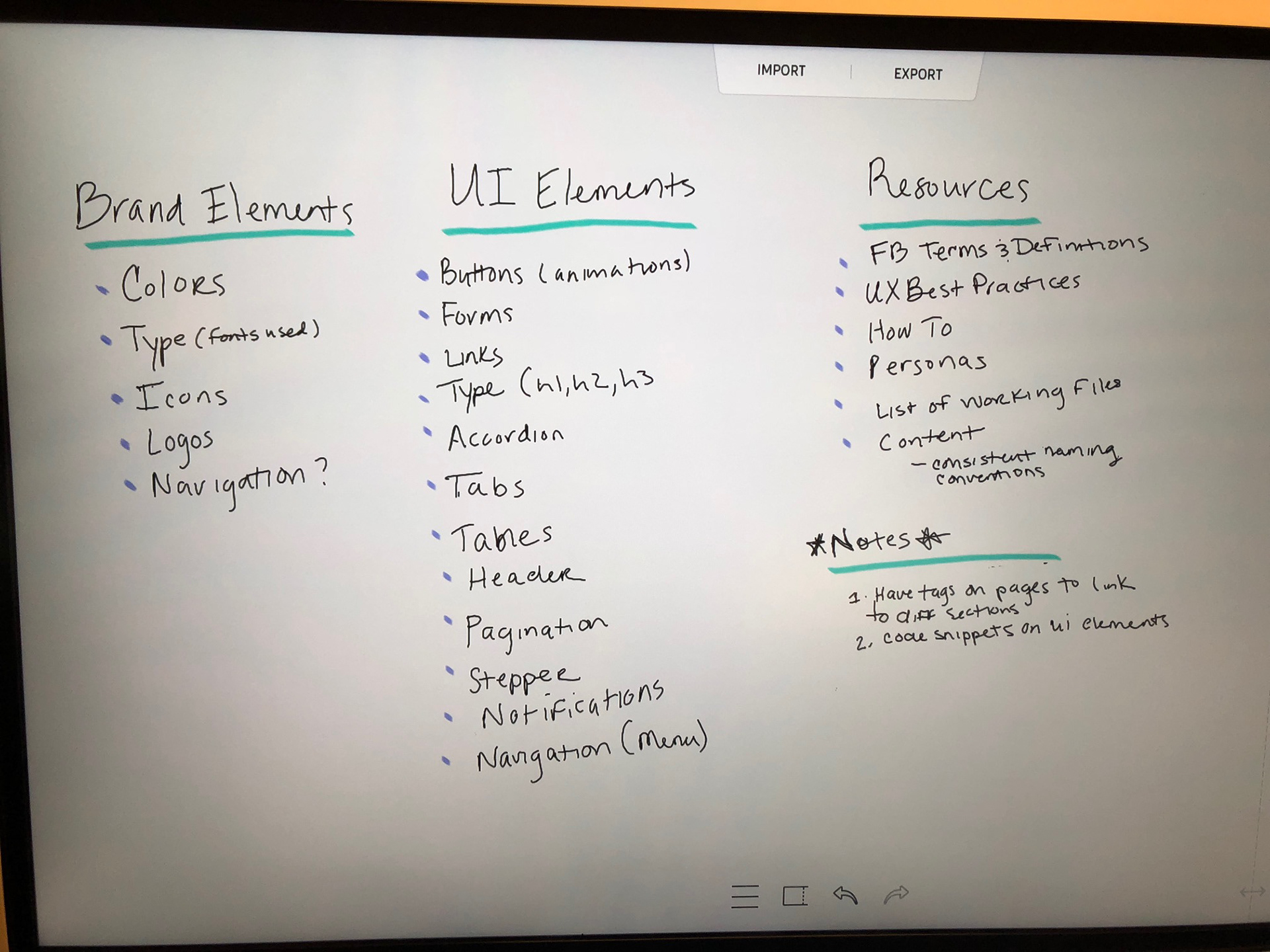
Mapping Out Components
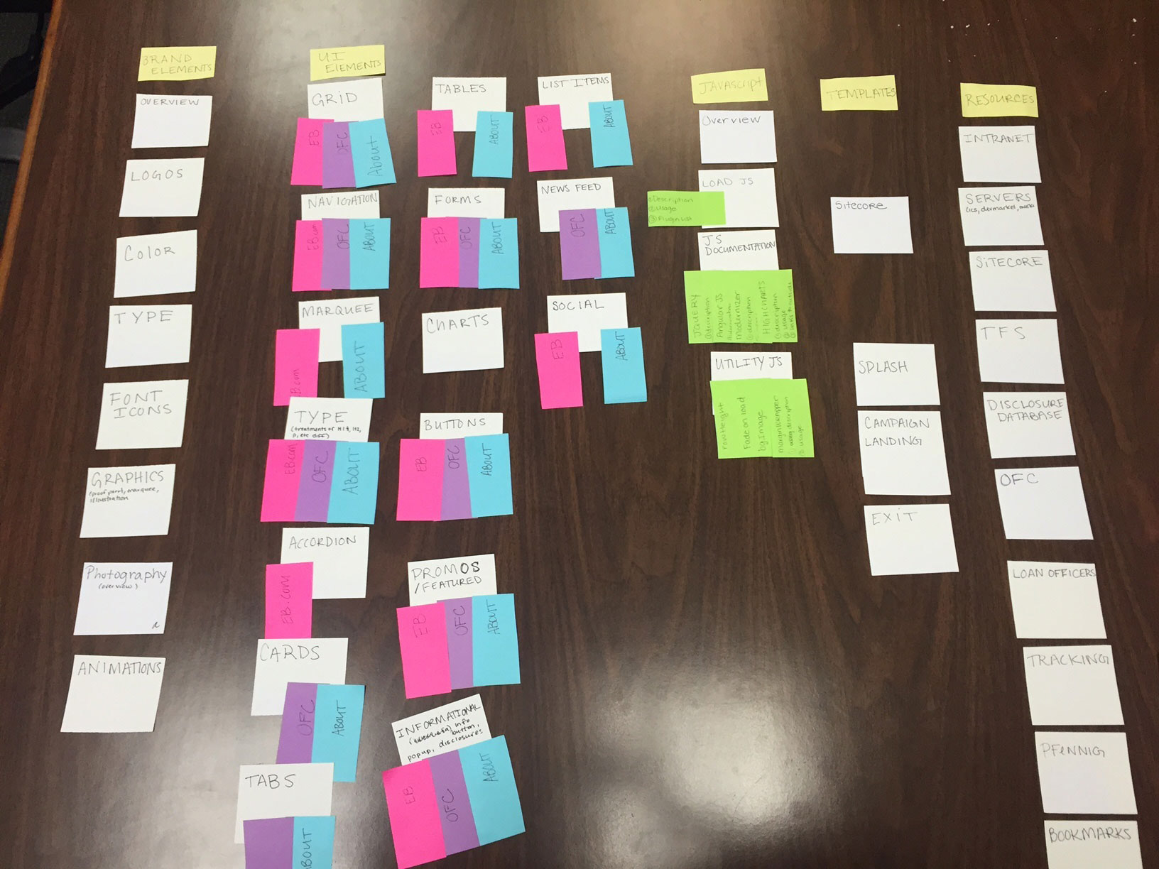
Using Card Sorting to Organize Components
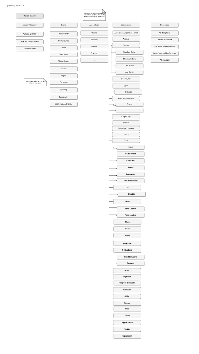
Finalized Component Inventory
Create pages and design components
I started with the simpler components because it's always best to start with the smallest components and work up from there, basically building up to more complex components.
During the creation of the components, I grouped them in the asset panel in meaningful categories. I also included usage guidelines on each page that housed a component. In the future, I plan to add working examples to this so that designers can see the components in use. Since we deal with such complex data-heavy applications, it's crucial to see how an application is using a component.
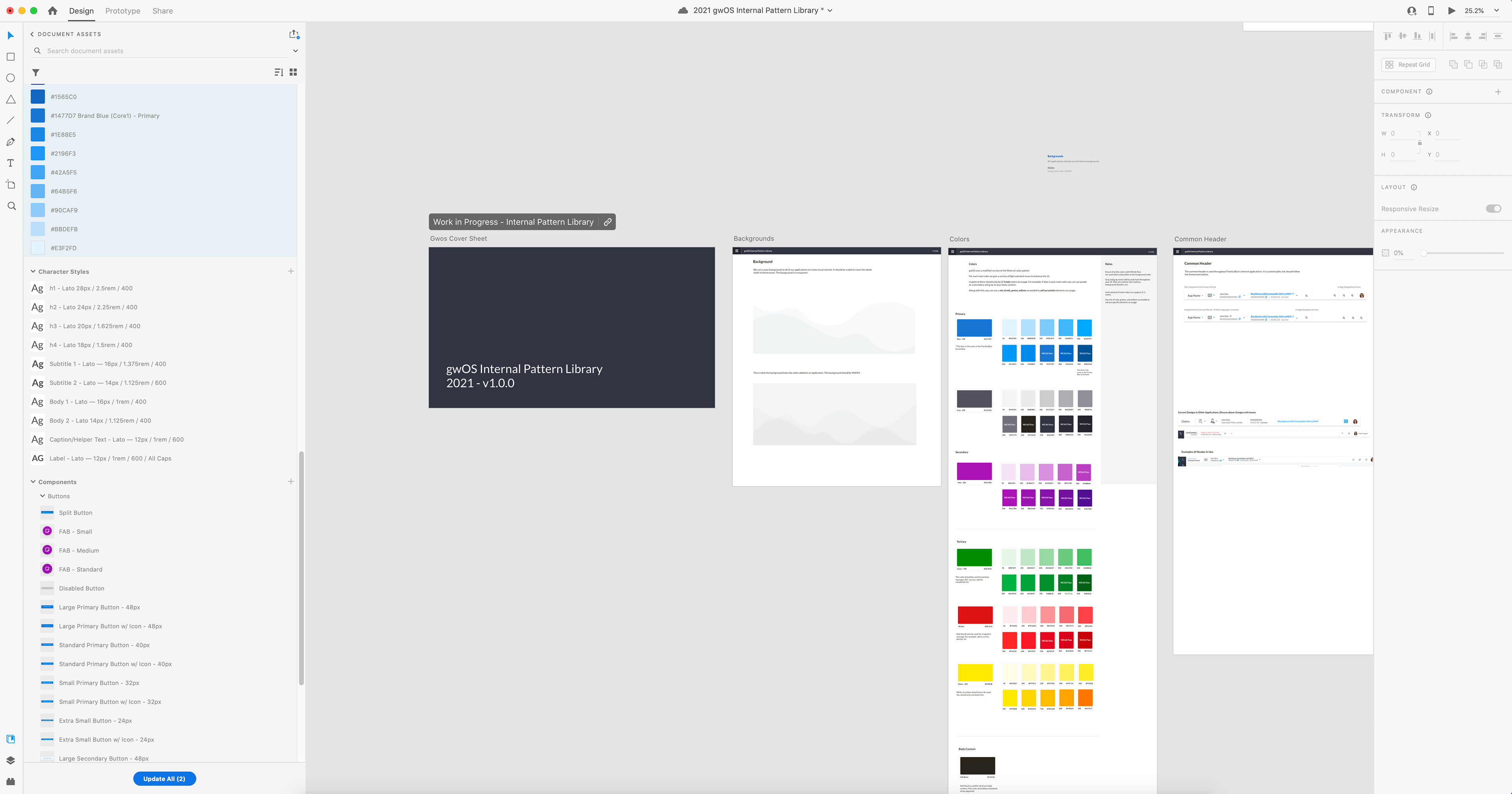
Working file showing assets/components in the left panel
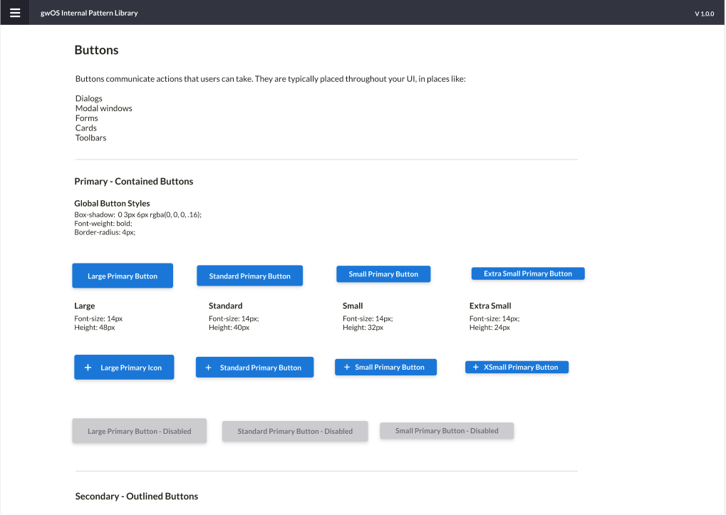
Started with Button Components
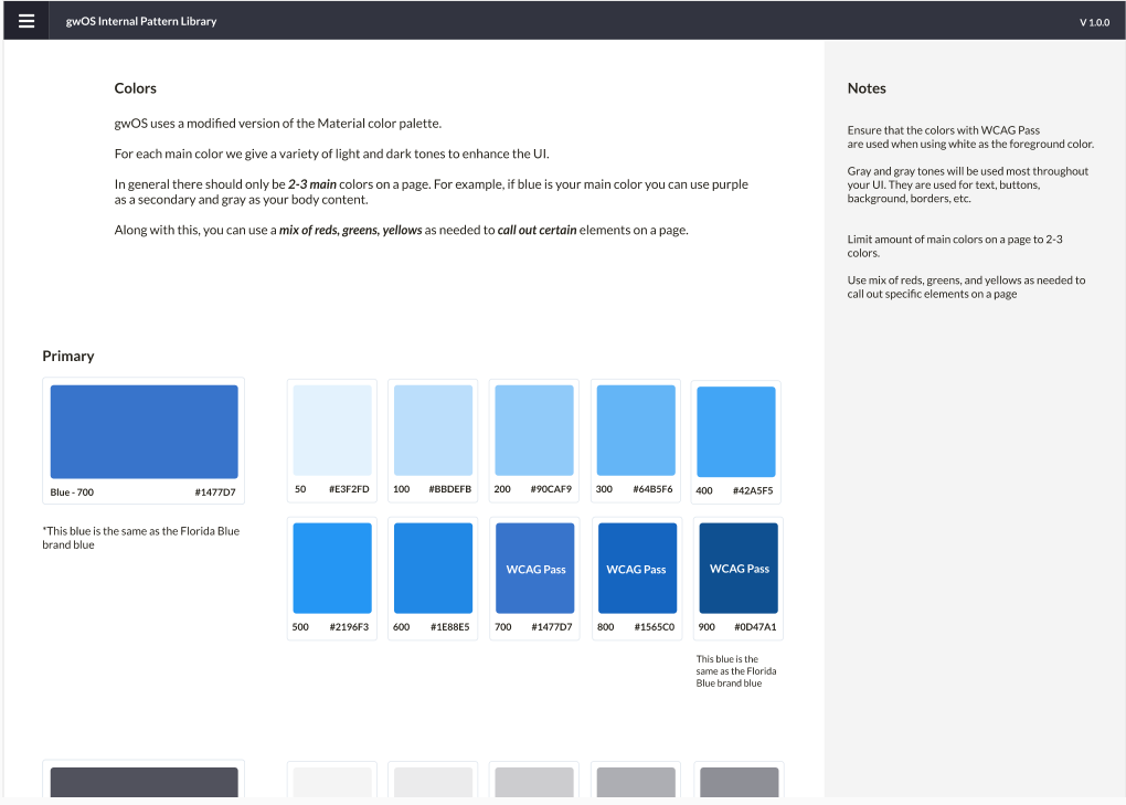
Started with Brand Colors and Usage Guidelines
Collaborate with tech
I collaborated with developers in creating our reusable react components based off Material UI. However, Material UI didn't cover all of our needs internally, so the components were built based on Material as our own Florida Blue library.
I collaborated with developers in creating our reusable react components based off Material UI. However, Material UI didn't cover all of our needs internally, so the components were built based on Material as our own Florida Blue library.
It's important that I'm collaborating with the developers at this point, because as they build out the components, I need to ensure that they are ADA compliant, function appropriately, and have styles that match the standards.
Below is an example of the start of our library in StoryBook.
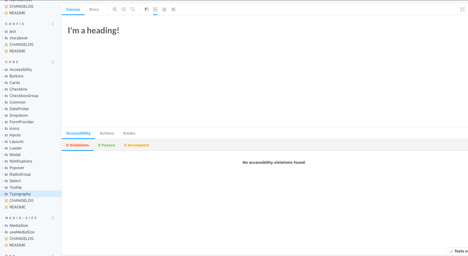
Storybook Component Creation
Document standards and guidelines
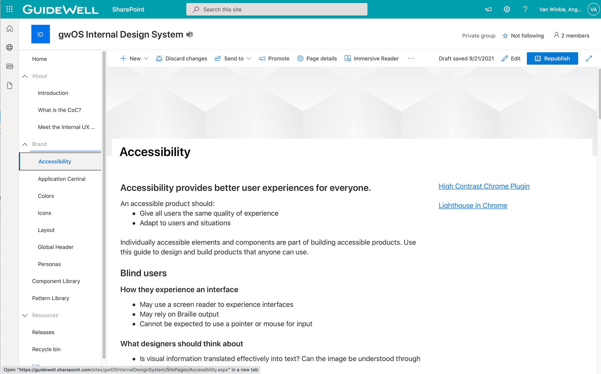
As I worked on the pattern library, I also documented standards and guidelines in Sharepoint. I explored other tools to house our design system, but was limited by what I could use internally. I scheduled my time where I worked one day on the component creation and another day on documentation in Sharepoint.
Outcome
This new pattern library allowed our internal design teams to start creating UI's that look and feel the same. Designers were able to take the published XD library and pull it into their working XD file. They were also able to drag and drop components onto their page to create a UI.
Note: This is a living document that was being updating so the link below was still a work in progress. Please expect unfinished components and/or standards.